Xerox Y2K
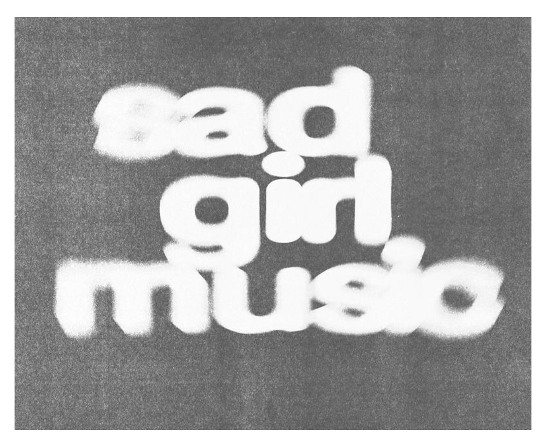
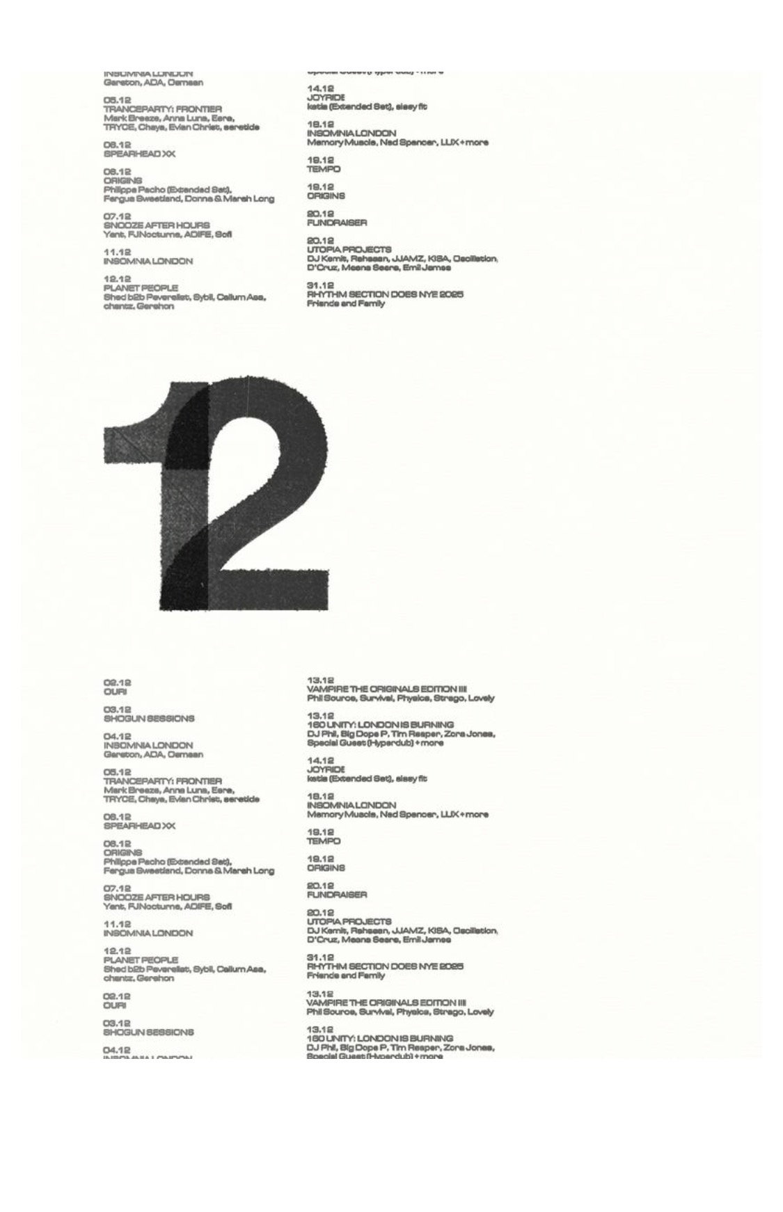
draftOne bold grotesque/rounded sans doing all the work. Display: huge, often lowercase, allowed to blur, overprint, or degrade. Body/meta: the same face set tiny (10–12px equivalent), tight columns, all function. No second typeface unless the project demands it.
Very airy overall; whitespace is structural. One enormous focal element per view, surrounded by air. Dense utilitarian clusters (listings, captions) are permitted as small tidy blocks that heighten the contrast.
Web translation: micro only, 100–200ms fades/opacity. Degradation effects (grain, blur) are static textures, never animated. No parallax, no scroll choreography.
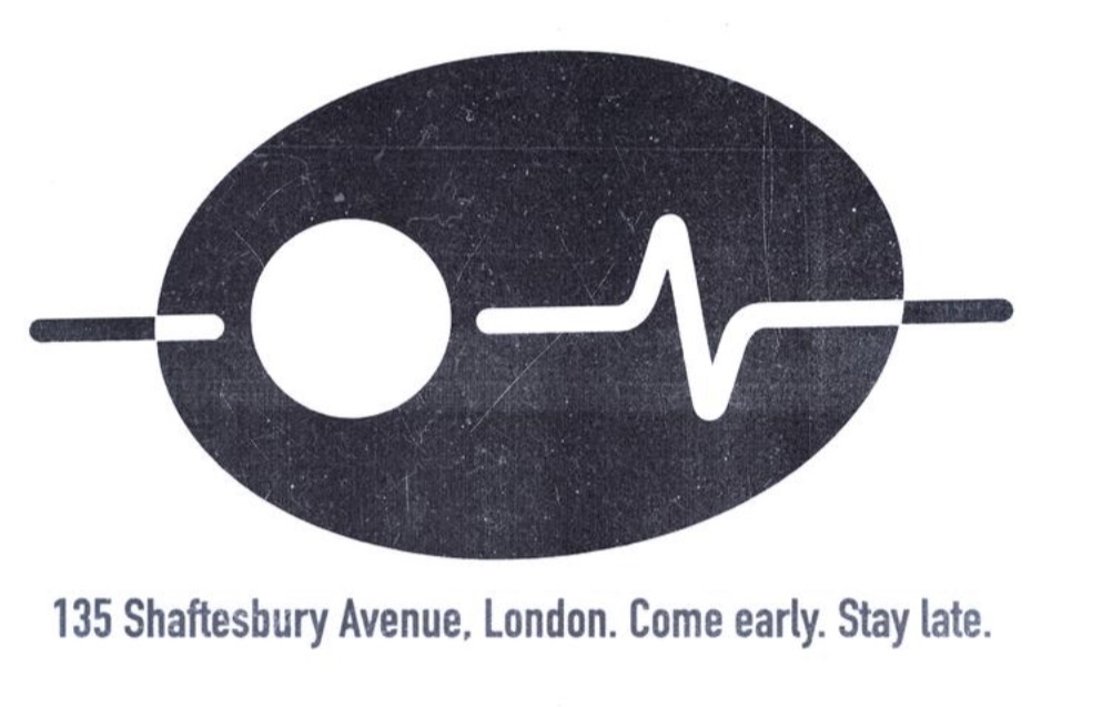
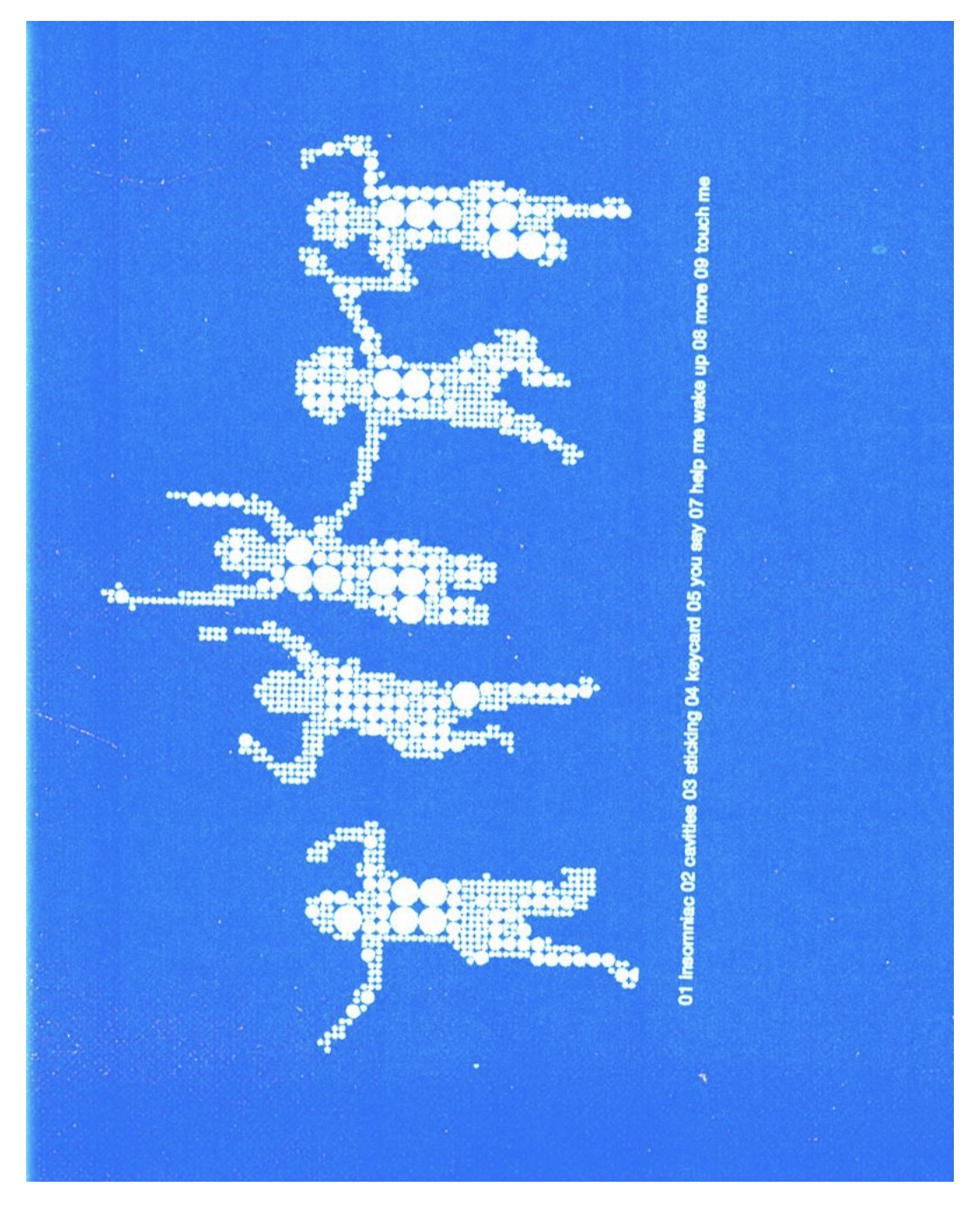
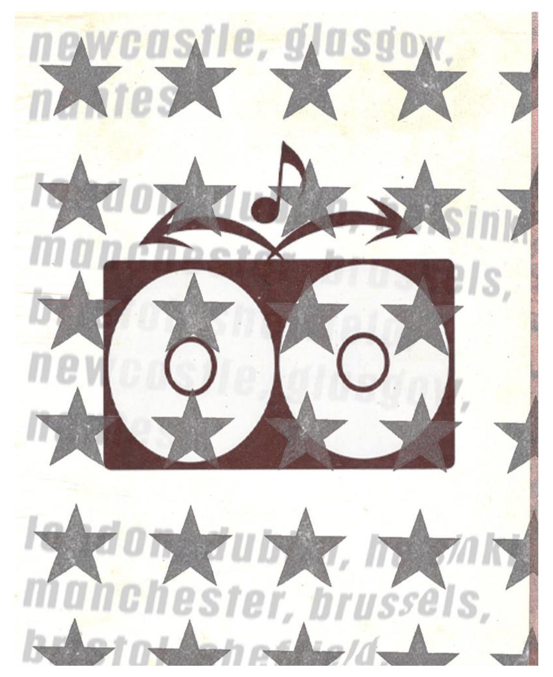
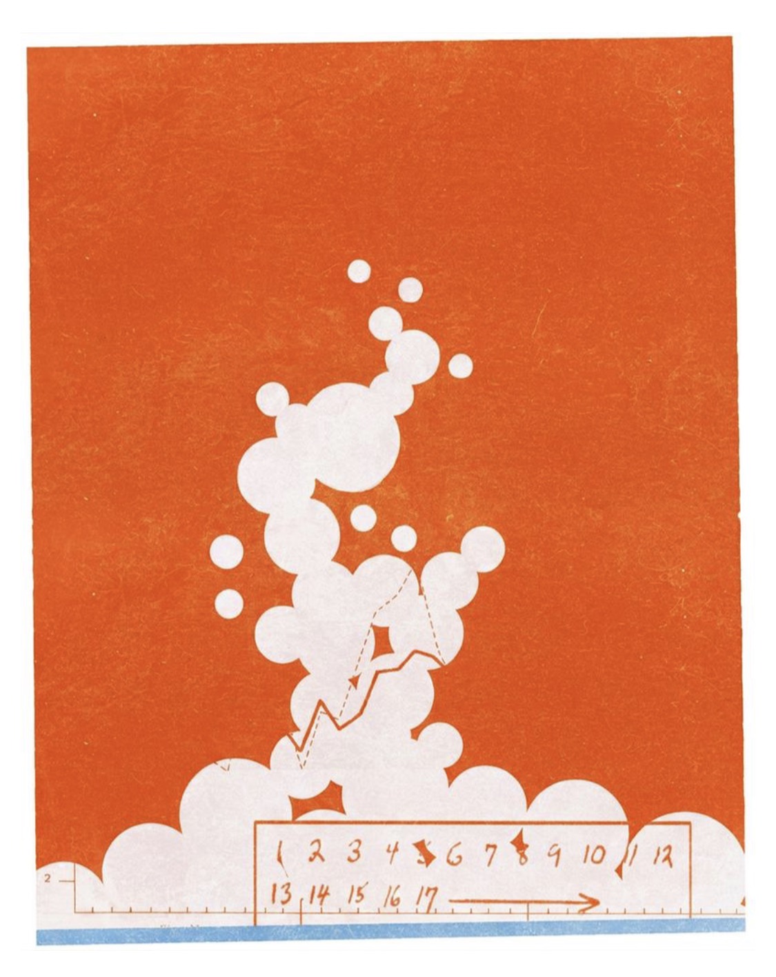
Late-90s/Y2K music-print culture translated to screen: photocopied melancholy, riso/halftone texture, misregistered overprint. Paper-off-white base OR one saturated field (blue/orange) + white. Type as image at the brand layer; everything flat — no gradients, no fake depth in the visual layer. Feels cheap-cool, functional, slightly melancholic, unmistakably authored. Key influence: Romina Malta. Guardrail: texture is seasoning, not costume — one or two analog moves per view, executed hard-edged and confident.