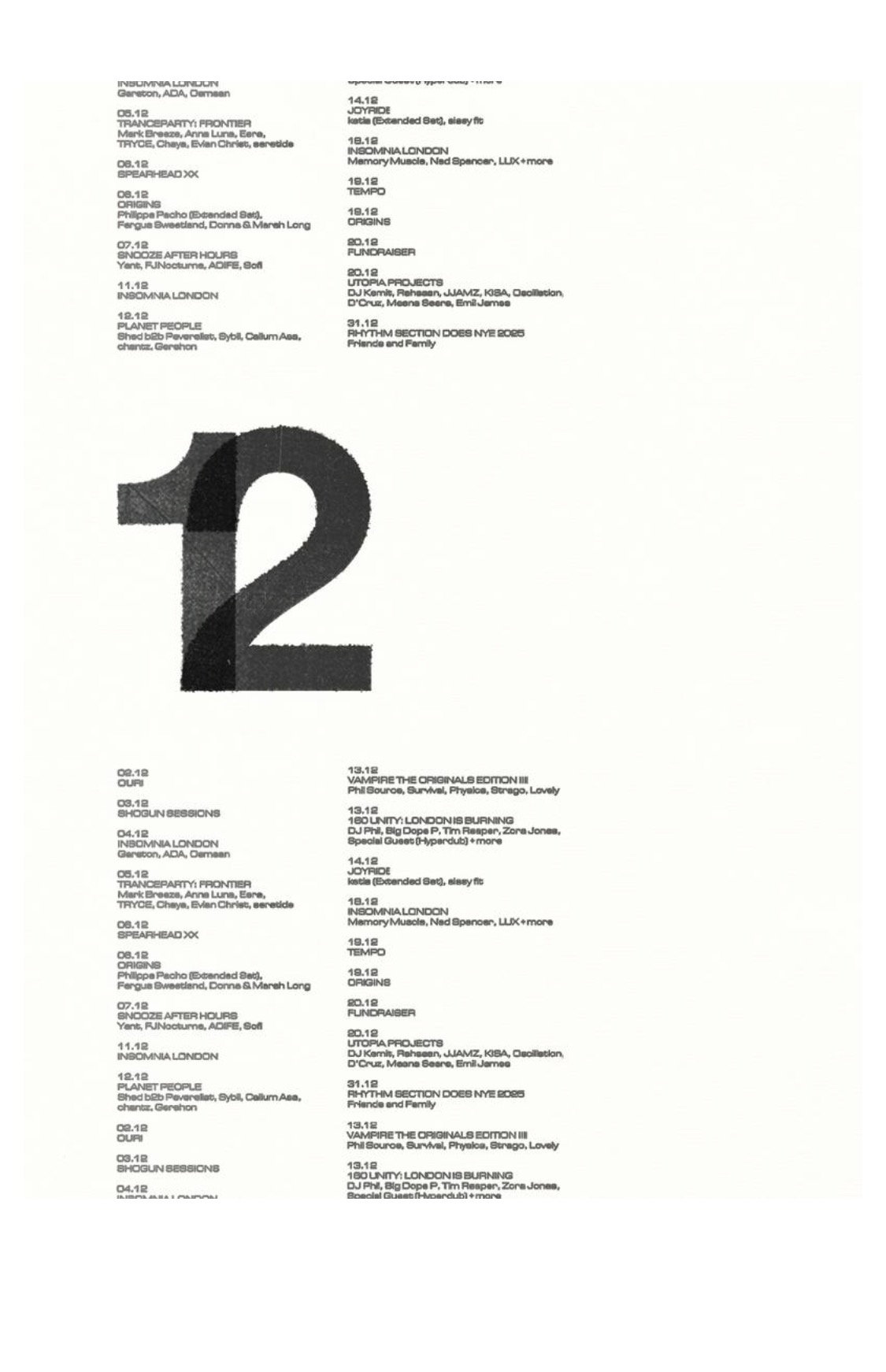
why it worksA degraded, overprinted giant '12' floats in whitespace between tidy two-column event listings set tiny. The clearest example of tension-of-scales: dense utilitarian information + one enormous typographic gesture + lots of air. Directly translatable to web layout.
tagstension-of-scalesbig-numerallistingswhitespaceeditorial